

Google’s Mobile-Friendly Test: What You Need to Know
The landscape of web consumption has undergone a profound transformation over the last decade, irrevocably shifting from desktop-centric browsing to a pervasive mobile-first experience. With smartphones and tablets becoming the primary devices for internet access for billions globally, search engines, particularly Google, have had to adapt their ranking algorithms to prioritize user experience on these smaller screens. Central to this adaptation is Google’s Mobile-Friendly Test (MFT), a crucial diagnostic tool and a foundational pillar of modern search engine optimization (SEO). Understanding the MFT, its implications, and the underlying principles of mobile-friendliness is no longer optional for website owners and digital marketers; it is an absolute imperative for online visibility and success.
The MFT emerged from Google’s commitment to delivering the most relevant and usable search results. Prior to its widespread adoption, many websites offered a subpar experience on mobile devices, characterized by tiny text, non-responsive layouts requiring endless pinching and zooming, difficult-to-tap buttons, and slow load times. This friction led to high bounce rates and user frustration. Google recognized that if a search result led to a difficult-to-use website on a mobile device, it undermined the quality of their search engine. The MFT, therefore, acts as a quality signal, indicating whether a page provides an adequate experience for mobile users.
Its genesis can be traced back to the “Mobilegeddon” update in April 2015, a pivotal moment that significantly boosted the ranking of mobile-friendly pages in mobile search results. This update served as a wake-up call for countless businesses, pushing them to invest in responsive design and other mobile optimization strategies. While Mobilegeddon was a significant step, the evolution didn’t stop there. Google continued to refine its approach, eventually introducing Mobile-First Indexing (MFI), where the mobile version of a website became the primary version used for indexing and ranking, even for desktop searches. The MFT, in this context, became not just a standalone diagnostic tool, but an integral component for ensuring a site’s readiness for MFI and its overall performance in an increasingly mobile-dominated search world. It assesses specific criteria that contribute to a positive mobile user experience, feeding into Google’s complex ranking signals.
The Mechanics of the Test: How to Use and Interpret Results
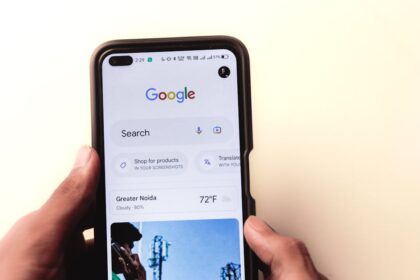
The Google Mobile-Friendly Test is remarkably straightforward to use, offering a quick assessment of a page’s mobile usability. There are two primary ways to access it. The most common method is directly through Google’s dedicated Mobile-Friendly Test tool, which can be found via a simple Google search or by navigating to search.google.com/test/mobile-friendly. Users simply input the URL of the page they wish to test and click “Test URL.”
Alternatively, for website owners, the Google Search Console (GSC) provides an integrated Mobile Usability report under the “Enhancements” section. This report offers a comprehensive overview of mobile-friendliness issues across an entire site, identifying specific pages that fail the test and providing reasons. It’s an invaluable resource for proactive monitoring and bulk issue identification, complementing the single-page testing capability of the standalone tool.
Upon submission of a URL, the MFT tool performs an immediate analysis. The results are presented clearly: either “Page is mobile-friendly” or “Page is not mobile-friendly.” If the page passes, a green banner confirms its mobile-friendliness, indicating that Googlebot can access and render the page effectively on a mobile device. This is the desired outcome.
If the page fails, the tool provides specific reasons for the failure. These reasons typically fall into categories such as “Text too small to read,” “Clickable elements too close together,” “Content wider than screen,” “Viewport not set,” or “Uses incompatible plugins.” Each listed issue is a direct actionable insight. For instance, “Text too small to read” implies that the font size on mobile screens falls below Google’s recommended minimums, hindering readability. “Clickable elements too close together” suggests that buttons or links are positioned too tightly, making it difficult for users to tap the correct target with their thumb or finger.
Beyond the pass/fail notification, the MFT tool offers two critical views for deeper analysis: the “screenshot” view and the “HTML” view. The screenshot view provides a visual representation of how Googlebot renders the page on a simulated mobile device. This is incredibly useful for identifying visual layout problems, content truncation, or elements that appear off-screen. It effectively shows what Google’s crawler “sees.” The HTML view, on the other hand, displays the raw HTML of the page as fetched by Googlebot, along with a list of “Page resources.” This latter list is crucial because it highlights any resources (CSS, JavaScript, images) that Googlebot was unable to load. Blocked resources are a common cause of mobile-friendliness failures, as they prevent Google from fully understanding and rendering the page’s layout and interactivity. If Googlebot cannot access the CSS, it cannot properly assess the page’s responsiveness or element spacing. Similarly, if JavaScript is blocked, dynamic content or navigation elements might not render correctly.
It is important to differentiate the MFT from other Google diagnostic tools like Lighthouse or PageSpeed Insights. While all aim to improve website performance and user experience, their primary focus differs. The Mobile-Friendly Test specifically checks for a basic set of mobile usability signals (viewport, text size, tap targets, content width). PageSpeed Insights and Lighthouse, however, offer a much broader and deeper audit of a page’s performance, accessibility, SEO, and best practices, including Core Web Vitals metrics (LCP, FID, CLS) that encompass loading speed, interactivity, and visual stability. A page can pass the MFT but still perform poorly on Lighthouse, indicating that while it’s “mobile-friendly” in a foundational sense, it may not be “mobile-performant” or offer an optimal user experience. The MFT is a threshold test; Lighthouse/PageSpeed Insights provide a comprehensive optimization roadmap.
Key Elements of a Mobile-Friendly Website: A Deep Dive
Achieving a “Page is mobile-friendly” status is not merely about ticking a box; it’s about implementing foundational design and technical principles that cater to the unique constraints and interactions of mobile devices. These elements are interconnected, and a holistic approach is essential.
Responsive Design: This is arguably the cornerstone of modern mobile-friendliness. Responsive Web Design (RWD) ensures that a website adapts its layout and content to fit various screen sizes, from large desktop monitors to small smartphone displays. It’s built upon three core components:
- CSS Media Queries: These are pivotal. Media queries allow developers to apply different CSS styles based on device characteristics like screen width, height, resolution, and orientation. For example, a media query can dictate that a website’s navigation menu transforms from a horizontal bar on desktop to a stacked “hamburger” icon on mobile screens below a certain pixel width. They enable the fluid rearrangement of content blocks, resizing of images, and adjustments to typography.
max-widthqueries are often used to define breakpoints where the layout changes. - Viewport Meta Tag: This seemingly small line of code in the
section of an HTML document is critically important.instructs the browser to set the viewport width to the device’s actual width in device-independent pixels (DIPs) and to set the initial zoom level to 1.0. Without this tag, mobile browsers might render the page at a desktop width (e.g., 980px) and then scale it down, making everything tiny and illegible. Common mistakes include omitting this tag entirely or settinguser-scalable=nowhich prevents users from zooming, a major accessibility barrier. - Flexible Images and Media: Images should scale dynamically with the screen size. Using
max-width: 100%; height: auto;in CSS for images ensures they never overflow their parent container while maintaining their aspect ratio. Similarly, videos and other embedded media need to be responsive, often achieved using aspect-ratio boxes or JavaScript libraries. - Fluid Grids: Instead of fixed-width layouts, responsive designs use percentage-based widths for columns and content blocks, allowing them to stretch and shrink proportionally.
Legible Content: Readability on small screens is paramount.
- Font Sizes: Google recommends a minimum base font size of 16 pixels (CSS pixels) for body text to ensure readability without zooming. Headings should be proportionally larger. This ensures users don’t have to strain their eyes or constantly zoom in.
- Line Height and Paragraph Spacing: Adequate line height (e.g., 1.5 to 1.8 times the font size) improves readability by providing enough vertical space between lines of text. Sufficient paragraph spacing prevents large blocks of text from appearing dense and overwhelming.
- Contrast Ratios: Text must have sufficient contrast against its background. The Web Content Accessibility Guidelines (WCAG) recommend a minimum contrast ratio of 4.5:1 for normal text and 3:1 for large text. This is crucial for users with visual impairments and for readability in varying light conditions.
Easy Navigation & Tap Targets: Mobile interaction is touch-based, necessitating design considerations for fingers.
- Adequate Spacing Between Interactive Elements: Buttons, links, and form fields need enough padding and margin around them to prevent accidental clicks on adjacent elements. Google recommends a minimum tap target size of 48×48 CSS pixels, even if the visual element is smaller.
- Navigation Patterns: Hamburger menus, off-canvas navigation, and bottom navigation bars are common patterns that conserve screen real estate while providing access to site features. However, it’s vital to ensure these menus are easily discoverable and intuitive. For content-heavy sites, a search bar should be prominently featured.
- Sticky Headers/Footers: Keeping critical navigation elements or calls to action persistently visible at the top or bottom of the screen can enhance usability, especially on longer pages.
Eliminating Annoying Interstitials & Pop-ups: Google takes a firm stance against intrusive interstitials that significantly degrade the mobile user experience.
- Intrusive Interstitials: These are full-screen pop-ups that obscure content immediately upon page load, requiring users to dismiss them before accessing information. Examples include newsletter sign-ups, app download prompts, or age verification gates that cover the entire screen. Google may penalize pages using such interstitials.
- Permissible Pop-ups: Not all pop-ups are penalized. Those that appear after a user has scrolled down a significant portion of the page, small banners for cookie consent, or age verification prompts that do not obscure the entire screen are generally acceptable. The key is that they do not block access to content immediately or disproportionately.
Fast Loading Times (Indirect but Crucial): While not directly tested by the MFT, page speed profoundly impacts mobile user experience and is a critical ranking factor, particularly with Core Web Vitals.
- Optimizing Images: Images are often the largest contributors to page weight. Use modern formats like WebP, compress images without losing quality, and lazy-load images that are below the fold. Ensure images are appropriately sized for the device, using
srcsetandsizesattributes. - Minifying CSS, JavaScript, HTML: Removing unnecessary characters (whitespace, comments) from code files reduces their size, speeding up download times.
- Leveraging Browser Caching: Instructing browsers to store static assets (images, CSS, JS) locally reduces the need to re-download them on subsequent visits.
- Server Response Time: A fast server is foundational. Optimize server configuration, database queries, and consider faster hosting providers.
- Content Delivery Networks (CDNs): CDNs cache content on servers geographically closer to users, reducing latency and accelerating delivery.
- Eliminating Render-Blocking Resources: CSS and JavaScript files in the
can block the browser from rendering content until they are fully loaded. Deferring non-critical JavaScript, inlining critical CSS, and loading CSS asynchronously can significantly improve the First Contentful Paint (FCP).
Viewport Configuration: Beyond the basic meta tag, proper configuration is key.
initial-scale,minimum-scale,maximum-scale: Whileinitial-scale=1.0is standard, inadvertently settingminimum-scaleormaximum-scalecan restrict user zooming, making content inaccessible for some. Google typically advises against restricting user zoom (user-scalable=no).- Common errors include not setting
width=device-widthwhich causes the page to render at an arbitrary default width, resulting in horizontal scrolling or tiny text.
Avoiding Incompatible Technologies: Historically, some technologies were problematic on mobile devices.
- Flash and Silverlight: These proprietary plugins were never widely supported on mobile browsers and are now largely obsolete. Modern web development relies on open standards like HTML5, CSS3, and JavaScript, which are universally supported. The MFT would flag pages relying heavily on these legacy plugins as non-mobile-friendly.
Implementing Mobile-Friendly Design Strategies
There are three primary strategies for delivering mobile-friendly content, each with its own advantages and considerations for SEO and development. Google strongly recommends responsive web design due to its efficiency and simplified maintenance.
1. Responsive Web Design (RWD):
- How it Works: RWD uses CSS media queries to apply different styles based on screen characteristics. It involves a single HTML codebase that adapts its layout, images, and content to fit various screen sizes. The server delivers the exact same HTML to all devices, with CSS determining the visual presentation.
- Pros:
- Single URL: Only one URL to manage for both desktop and mobile, simplifying SEO (no duplicate content concerns, easier canonicalization, link equity flows directly to one URL).
- Simplified Maintenance: Updates to content or design only need to be applied once.
- Improved User Experience: Provides a consistent experience across devices, reducing cognitive load for users.
- Google’s Preferred Method: Google explicitly recommends RWD, citing its efficiency for crawling and indexing, as Googlebot only needs to crawl a single version of the site.
- Cons:
- Potential for Larger File Sizes: The single codebase might mean sending more CSS/JS to a mobile device than strictly necessary for that screen size, though techniques like code splitting and critical CSS can mitigate this.
- Design Complexity: Can be more complex to design and develop initially, requiring careful planning of breakpoints and content flow.
- Performance Challenges: If not optimized, large responsive images or excessive JavaScript can still lead to slow mobile load times.
- Implementation Considerations:
- Mobile-First CSS: Designing CSS with mobile devices in mind first (e.g., small screens first, then adding styles for larger screens with
min-widthmedia queries) often leads to more efficient and performant code. - Content Prioritization: Identify and prioritize critical content for mobile users, making sure it’s easily accessible without excessive scrolling.
- Touch-Friendly Elements: Ensure all interactive elements are easily tappable.
- Mobile-First CSS: Designing CSS with mobile devices in mind first (e.g., small screens first, then adding styles for larger screens with
2. Dynamic Serving:
- How it Works: With dynamic serving, the server detects the user’s device (via the User-Agent HTTP header) and delivers different HTML and CSS to different devices from the same URL. The URL remains consistent, but the content delivered changes based on whether the request comes from a desktop browser or a mobile browser.
- Pros:
- Single URL: Like RWD, it maintains a single URL, simplifying SEO.
- Optimized Content Delivery: Can deliver highly optimized HTML/CSS tailored precisely for each device type, potentially leading to faster load times on mobile by sending only necessary assets.
- Cons:
- Requires User-Agent Detection: The server must accurately detect the User-Agent, which can be complex and prone to errors as new devices and browsers emerge. Incorrect detection can lead to desktop content being served to mobile users or vice-versa (cloaking risk).
- Vary HTTP Header: Crucial for SEO. The server must send a
Vary: User-AgentHTTP header with its response. This tells caching servers (and Googlebot) that the content served depends on the User-Agent, preventing them from serving the wrong cached version to different devices. Without this, Googlebot might cache the desktop version and serve it to mobile users, leading to a poor experience and potential ranking issues. - Increased Server-Side Complexity: Requires more sophisticated server-side logic and maintenance compared to RWD.
- SEO Considerations: Proper implementation of the
Vary: User-Agentheader is paramount. Googlebot needs to be able to crawl both the mobile and desktop versions by sending different user-agent strings.
3. Separate URLs (m.dot sites):
- How it Works: This strategy involves maintaining two separate websites: one for desktop (e.g.,
www.example.com) and a completely separate one for mobile (e.g.,m.example.com). Each version has its own distinct URL structure and often entirely different content, design, and even server infrastructure. - Pros:
- Complete Customization: Allows for highly customized experiences for each device type, potentially optimizing performance by delivering minimal, mobile-specific code.
- Simpler Development (for each version): Developers can focus on building for a single environment without the complexities of responsive design.
- Cons:
- Duplicate Content Issues: Because content exists on two separate URLs, careful annotation is required to prevent Google from seeing them as duplicate content.
- Complex SEO Management: Requires managing two separate sets of SEO efforts (link building, content optimization, technical SEO). Link equity can be diluted across two versions.
- Higher Maintenance Overhead: Doubled development, testing, and content management effort.
- User Experience Friction: Users might accidentally land on the wrong version or be redirected incorrectly, leading to frustration.
- Google’s Least Preferred Method: Google explicitly states RWD is preferred due to the complexities of separate URLs.
- Annotation with
rel="alternate"andrel="canonical":- On the desktop page (
www.example.com/page), add alink rel="alternate" media="only screen and (max-width: 640px)" href="http://m.example.com/page"tag. This tells Google that there’s an alternative mobile version of this page. - On the mobile page (
m.example.com/page), add alink rel="canonical" href="http://www.example.com/page"tag. This tells Google that the desktop page is the canonical (preferred) version, consolidating ranking signals. - This bidirectional annotation is crucial for Google to understand the relationship between the two pages and consolidate ranking signals correctly.
- On the desktop page (
While all three strategies can result in a mobile-friendly site, Google’s strong preference for Responsive Web Design is clear due to its efficiency and reduced complexity for both developers and search engines.
Common Mobile-Friendly Test Errors and Solutions
Understanding the specific error messages from the Google Mobile-Friendly Test is the first step toward remediation. Each message points to a particular aspect of mobile usability that needs attention.
1. “Content wider than screen”
- Issue: The page’s content (text, images, containers) extends beyond the viewport width, requiring horizontal scrolling on mobile devices. This is a significant usability flaw.
- Solution:
- Viewport Meta Tag: Ensure the
is correctly implemented in theof your HTML. - Responsive Images: Use CSS
max-width: 100%; height: auto;for all images to prevent them from overflowing their containers. Consider using theelement orsrcsetattribute for serving appropriately sized images. - Fluid Layouts: Ensure all container elements, tables, or
divs use percentage-based widths ormax-widthproperties instead of fixed pixel widths. - Overflowing Elements: Check for any elements (e.g., pre-formatted text, long URLs, tables) that have fixed widths or are excessively large and cannot wrap. Apply CSS properties like
word-wrap: break-word;oroverflow-x: auto;for tables.
- Viewport Meta Tag: Ensure the
2. “Clickable elements too close together”
- Issue: Interactive elements like buttons, links, or form fields are positioned too closely, making it hard for users to accurately tap the intended target with their finger, often leading to misclicks.
- Solution:
- Increase Padding/Margins: Add sufficient padding around clickable elements using CSS (e.g.,
padding: 12px;ormargin: 10px;). - Minimum Target Size: While visually a button might be small, ensure its clickable area (hitbox) is at least 48×48 CSS pixels. This can be achieved with larger padding or by wrapping smaller elements in larger clickable
divs. - Check Navigation: Ensure navigation links, especially in footers or small menus, have adequate spacing.
- Increase Padding/Margins: Add sufficient padding around clickable elements using CSS (e.g.,
3. “Text too small to read”
- Issue: The font size used for main body text or other crucial content is too small for comfortable reading on a mobile device without zooming.
- Solution:
- Base Font Size: Set a base font size of at least 16 CSS pixels for body text. Use relative units like
emorremfor other text elements to maintain proportionality. - Viewport Configuration: Re-verify the viewport meta tag is set correctly. If it’s missing or misconfigured, the browser might zoom out the entire page, making all text appear tiny.
- Media Queries for Text: Use CSS media queries to adjust font sizes for different screen sizes, increasing them for larger screens while maintaining a legible base for mobile.
- Base Font Size: Set a base font size of at least 16 CSS pixels for body text. Use relative units like
4. “Uses incompatible plugins”
- Issue: The page relies on deprecated or unsupported plugins like Flash or Silverlight for displaying content or functionality. Mobile browsers typically do not support these.
- Solution:
- Remove or Replace Plugins: Replace any Flash or Silverlight content with modern, open-standard alternatives like HTML5, CSS3, JavaScript, or embedded video formats (e.g., MP4). This error is less common now as most websites have moved away from these technologies.
5. “Viewport not set” or “Viewport not configured for ‘device-width'”
- Issue: The vital viewport meta tag is either missing from the HTML’s
section, or it’s incorrectly configured (e.g.,width=auto, fixed width, oruser-scalable=no). - Solution:
- Add Correct Viewport Tag: Ensure this exact line is present in your page’s
:. - Avoid Restrictive Settings: Do not use
user-scalable=noor set fixedminimum-scaleormaximum-scalevalues, as these prevent users from zooming, which can be an accessibility issue.
- Add Correct Viewport Tag: Ensure this exact line is present in your page’s
6. “Blocked resources”
- Issue: Googlebot was unable to access critical resources (CSS files, JavaScript files, images) necessary to properly render and understand the layout and functionality of the page. This often happens because of
robots.txtdisallows, server issues, or firewalls. If CSS is blocked, Google cannot assess the page’s responsiveness. If JavaScript is blocked, dynamic content or navigation might not load. - Solution:
- Check robots.txt: Verify that your
robots.txtfile is not disallowing Googlebot from crawling your CSS, JavaScript, or image directories. A common mistake is to disallow/wp-content/or/assets/for “security” reasons, which inadvertently blocks critical files. - Verify Resource Paths: Ensure that the paths to your CSS, JS, and image files are correct and that these files are indeed present on your server.
- Server/Firewall Issues: Check your server logs or firewall settings to ensure they are not blocking Googlebot’s access to these resources.
- Fetch as Google/URL Inspection Tool: Use GSC’s URL Inspection tool to perform a “Live Test” on the affected page. This will show you exactly which resources Googlebot is unable to fetch and provide more specific error details.
- Check robots.txt: Verify that your
Addressing these common errors systematically will significantly improve a site’s mobile-friendliness and its performance in Google’s Mobile-Friendly Test.
The Interplay with Mobile-First Indexing
The Google Mobile-Friendly Test is inextricably linked with Mobile-First Indexing (MFI), forming a cornerstone of Google’s mobile search strategy. Understanding this relationship is crucial for any site aiming for strong organic visibility.
What is Mobile-First Indexing (MFI)?
Before MFI, Google primarily used the desktop version of a website’s content for indexing and ranking purposes, even for mobile searches. This meant that if a site had a robust desktop version but a stripped-down or poorly optimized mobile version, the desktop content would dictate its search performance, regardless of the mobile user experience.
MFI flipped this paradigm. With MFI, Google primarily uses the mobile version of a website’s content for indexing and ranking all pages, for all users (both mobile and desktop). This means that if your mobile site is missing content, has blocked resources, or is not mobile-friendly, it directly impacts your rankings, even if your desktop site is perfect.
How MFI Uses the Mobile Version:
When Googlebot (specifically Googlebot Smartphone) crawls your site, it now prioritizes fetching and indexing the mobile content. This mobile content becomes the primary source for understanding the page’s structure, content, links, and overall quality. Any SEO signals, such as keyword relevance, structured data, canonical tags, and link equity, are now primarily derived from the mobile version of your pages.
The MFT’s Role as a Precursor and Ongoing Check for MFI:
The Mobile-Friendly Test serves as a vital diagnostic tool to ensure a site is ready for MFI and continues to meet its requirements.
- Pre-MFI Readiness: Before Google moved sites to MFI, they strongly advised ensuring mobile-friendliness. Passing the MFT was a key indicator of readiness. If a site was not mobile-friendly, Google would often delay its migration to MFI, or it would continue to index the desktop version, which could lead to poor rankings for mobile users.
- Ongoing Compliance: Even after a site is moved to MFI, the MFT remains critical. Any new pages or significant changes to existing pages should be tested. If a previously mobile-friendly page becomes non-mobile-friendly due to a code update, it can quickly impact its rankings under MFI. Google’s Mobile Usability report in GSC (which pulls data from the MFT) will flag these issues, prompting immediate action.
- Visibility of Content: The MFT checks if Googlebot can render the page correctly, including accessing critical CSS and JavaScript. If these resources are blocked, Googlebot cannot see the full mobile layout or dynamic content. Under MFI, this means that content (text, images, features) that is only loaded via JavaScript or styled with blocked CSS might not be indexed, even if it’s present on the mobile version.
Common MFI Issues Related to Non-Mobile-Friendliness:
- Content Discrepancies: If the mobile version has less content than the desktop version (e.g., hidden tabs, fewer images, missing text), Google will only index what’s on the mobile version, potentially leading to a loss of ranking signals.
- Blocked Resources: As discussed, if CSS/JS are blocked, Google cannot properly assess the page’s responsiveness, or even see the full content and interactive elements.
- Lazy Loading Issues: If content is lazy-loaded but the lazy-loading script is not correctly implemented or executed by Googlebot, that content might not be indexed.
- Internal Linking: Ensure internal links on the mobile version are crawlable and point to the correct mobile URLs (if using separate URLs) or the same URLs (if using RWD).
- Structured Data: Structured data must be present and consistent on the mobile version of the page if it’s important for rich results.
Checking MFI Status in GSC:
Website owners can check their MFI status in Google Search Console under “Settings” > “About this property” > “Crawl stats” or “Indexing” > “Pages”. Google will clearly state if the site is being indexed using the mobile or desktop version. If it says “Indexing: Smartphone,” your site is primarily indexed via the mobile version, reinforcing the importance of passing the MFT.
In essence, the Mobile-Friendly Test is the gatekeeper to optimal performance in a Mobile-First Indexing world. A passing score ensures that Google can effectively crawl, render, and understand your mobile content, which is now the definitive version for ranking. Neglecting mobile-friendliness in the MFI era is tantamount to neglecting your entire SEO strategy.
Beyond the MFT: Holistic Mobile SEO
While passing the Mobile-Friendly Test is a fundamental requirement, true mobile SEO extends far beyond this basic check. It encompasses a holistic approach to user experience, performance, and visibility across all aspects of the mobile journey.
1. User Experience (UX) on Mobile:
- Funnels and Conversion Rates: A mobile-friendly site should facilitate smooth user journeys and conversions. Analyze mobile bounce rates, time on site, and conversion funnels. If users are dropping off at specific stages, it might indicate UX issues like complex forms, difficult navigation, or confusing calls to action.
- Touch Interactions and Gestures: Design for touch. Ensure swipe gestures are intuitive where applicable (e.g., image carousels). Avoid designs that rely heavily on hover states, as these don’t translate well to touchscreens.
- Accessibility (WCAG Guidelines for Mobile): Mobile accessibility is crucial. This includes legible text sizes, sufficient color contrast, keyboard navigability (for those using assistive technologies), proper ARIA labels, and ensuring all interactive elements are reachable and usable by everyone, including those with disabilities. WCAG guidelines provide comprehensive standards for web accessibility, many of which are particularly pertinent to mobile.
2. Local SEO on Mobile:
- “Near Me” Searches: Mobile devices are primary drivers of local searches (e.g., “coffee shop near me”). Ensure your site is optimized for these queries.
- Google My Business (GMB): A fully optimized and accurate Google My Business profile is non-negotiable for local mobile visibility. This includes accurate name, address, phone number (NAP), hours, photos, and customer reviews.
- Schema Markup for Local Businesses: Implement local business schema markup (e.g.,
LocalBusiness,Organization) on your website to provide structured data to search engines, helping them understand your business’s location, services, and contact information. This enhances visibility in local packs and Google Maps.
3. Voice Search Optimization:
- Conversational Queries: Mobile users frequently use voice assistants. Optimize content for conversational, long-tail keywords (e.g., “what’s the best Italian restaurant in London” rather than just “Italian restaurant London”).
- Featured Snippets: Voice search often pulls answers directly from featured snippets. Structure your content to answer common questions concisely and directly to increase your chances of appearing in snippets.
- FAQs: Create dedicated FAQ sections that directly answer common user questions in a clear, concise manner, making them ideal candidates for voice search queries.
4. AMP (Accelerated Mobile Pages):
- Purpose and Benefits: AMP is an open-source framework designed to create lightning-fast mobile web pages. It uses a restricted subset of HTML, CSS, and JavaScript to enforce performance best practices. AMP pages are often cached by Google’s CDN, leading to near-instant loading times. They can appear in Google’s “Top Stories” carousel on mobile.
- Limitations and Ongoing Relevance: While initially a major focus for Google, AMP’s prominence has somewhat waned, especially with the introduction of Core Web Vitals as a broader performance metric. AMP is primarily beneficial for content-heavy sites (news, blogs) where speed is paramount. It introduces a separate version of content, requiring additional maintenance, similar to separate mobile sites.
- Implementation and Validation: AMP pages require specific HTML markup, and they must pass AMP validation tools to ensure compliance.
5. Progressive Web Apps (PWAs):
- Definition: PWAs are web applications that utilize modern web capabilities to deliver an app-like experience to users. They are accessible via a browser but can be added to a user’s home screen, offer offline capabilities, and send push notifications.
- Service Workers: Central to PWAs, Service Workers enable offline functionality, caching, and push notifications by acting as a proxy between the browser and the network.
- Benefits: PWAs combine the reach of the web with the engagement of native apps, offering fast, reliable, and engaging experiences. They are naturally mobile-friendly due to their design principles.
6. Core Web Vitals and Mobile:
- Overview: Core Web Vitals (CWV) are a set of three specific metrics that Google considers crucial for overall user experience: Largest Contentful Paint (LCP), First Input Delay (FID), and Cumulative Layout Shift (CLS). They are part of Google’s broader Page Experience signals for ranking.
- LCP (Largest Contentful Paint): Measures loading performance. It reports the render time of the largest image or text block visible within the viewport. For a good user experience, LCP should occur within 2.5 seconds of when the page first starts loading. On mobile, slow networks and large images are common culprits for poor LCP.
- FID (First Input Delay): Measures interactivity. It quantifies the time from when a user first interacts with a page (e.g., clicks a button, taps a link) to when the browser is actually able to respond to that interaction. A good FID is less than 100 milliseconds. High FID usually indicates heavy JavaScript execution blocking the main thread, a common mobile performance issue.
- CLS (Cumulative Layout Shift): Measures visual stability. It quantifies the unexpected shifting of visual page content as it loads. A good CLS score is less than 0.1. Common causes on mobile include images without dimensions, dynamically injected content, and unoptimized font loading.
- Tools for Measuring CWV:
- Google Search Console Core Web Vitals Report: Provides a site-wide overview of CWV performance, identifying groups of URLs that need attention (desktop and mobile separately).
- Google PageSpeed Insights: Offers detailed lab and field data for individual URLs, providing specific recommendations for improving CWV metrics.
- Lighthouse (in Chrome DevTools): A powerful auditing tool built into Chrome, providing detailed performance, accessibility, and SEO audits, including CWV.
- Chrome DevTools Performance Tab: For advanced debugging and identifying performance bottlenecks.
Achieving a high score in the Mobile-Friendly Test is merely the entry point. A truly successful mobile SEO strategy requires a continuous focus on optimizing every aspect of the mobile user journey, from page speed and interactivity to local search presence and an accessible design.
Tools and Resources for Mobile-Friendliness
Leveraging the right tools is essential for diagnosing, implementing, and monitoring mobile-friendliness. Google provides several powerful utilities, complemented by browser-based developer tools and third-party solutions.
1. Google Search Console (GSC):
- Mobile Usability Report: This is your primary dashboard for site-wide mobile-friendliness. Located under “Enhancements,” it reports on issues such as “Text too small,” “Clickable elements too close,” and “Content wider than screen” across your entire site. It shows how many pages are affected and provides example URLs. Regularly checking this report is crucial for proactive maintenance.
- URL Inspection Tool: For individual page diagnostics, the URL Inspection tool allows you to “Inspect” any URL on your site. It provides information on index coverage, canonicalization, and whether the page is mobile-friendly. Crucially, the “Test Live URL” feature allows you to see how Googlebot currently renders the page, identifies blocked resources, and provides a mobile-friendly assessment in real-time. This is invaluable for debugging specific page issues.
- Mobile-Friendly Test within GSC: While a standalone tool exists, GSC integrates the MFT functionality directly into the URL Inspection tool, providing a streamlined workflow for site owners.
2. Google PageSpeed Insights / Lighthouse:
- Purpose: These tools go beyond basic mobile-friendliness to provide comprehensive performance and user experience audits, including Core Web Vitals scores. They analyze both desktop and mobile versions of a page.
- PageSpeed Insights: Simply enter a URL, and it provides both “field data” (real-user data from the Chrome User Experience Report) and “lab data” (simulated performance data). It offers specific recommendations for improvements, categorized by impact level.
- Lighthouse (Chrome DevTools): Built directly into the Chrome browser’s developer tools (under the “Lighthouse” tab), it allows for on-the-fly audits of any webpage. It generates a report with scores for Performance, Accessibility, Best Practices, SEO, and Progressive Web App features, providing actionable advice for each. It’s an excellent tool for developers during the building and testing phases.
3. Chrome DevTools:
- Device Mode: The “Toggle device toolbar” icon (often looks like a phone and tablet) in Chrome DevTools allows you to simulate various mobile devices, including different screen sizes, resolutions, and even network conditions (e.g., 3G, offline). This is invaluable for live testing responsive designs.
- Performance Tab: Provides a detailed timeline of how a page loads and renders, identifying bottlenecks in JavaScript execution, rendering, and network requests. Essential for optimizing Core Web Vitals.
- Network Tab: Shows all network requests, their sizes, and loading times, helping identify large assets or slow server responses.
- Elements Tab: Allows for live editing of HTML and CSS, enabling quick testing of layout and styling changes for mobile.
- Audits Tab (Lighthouse integration): As mentioned, Lighthouse is integrated directly here.
4. Bing Webmaster Tools:
- While Google is dominant, Bing also offers a “Mobile-Friendliness” report within its Webmaster Tools. It provides similar insights into how Bingbot perceives your site’s mobile usability, though its criteria might slightly differ from Google’s. It’s a good secondary check.
5. Online Responsive Design Testers:
- Numerous free online tools allow you to input a URL and see how it renders on various pre-defined device sizes (e.g., iPhone, iPad, common Android devices). While not as deep as Google’s official tools, they offer a quick visual check across multiple viewports. Examples include Am I Responsive?, Responsively App, or browser extensions that offer similar functionality.
6. User-Agent Switchers:
- Browser extensions (e.g., “User-Agent Switcher for Chrome”) allow you to change your browser’s User-Agent string. This can be useful for testing dynamically served sites or for verifying how your server responds when it detects different device types (e.g., Googlebot Smartphone, specific mobile devices).
Continuous Monitoring and Maintenance
Mobile-friendliness is not a one-time project; it’s an ongoing commitment. The web is constantly evolving, with new devices, browser capabilities, and Google algorithm updates emerging regularly. Therefore, continuous monitoring and maintenance are paramount to ensure sustained mobile performance and visibility.
1. Regularly Check Google Search Console Mobile Usability Report:
- This is your frontline defense. Make it a habit to check this report weekly or monthly, especially if you have an active website with frequent updates.
- Spikes in “Errors” or new issues appearing in the report are red flags that require immediate investigation. They could indicate recent code deployments that broke mobile responsiveness, new content that wasn’t optimized, or issues with Googlebot’s ability to crawl resources.
- Use the “Validate Fix” feature in GSC after implementing changes. This will prompt Google to re-crawl the affected URLs and verify your fixes.
2. Test New Pages or Significant Design Changes:
- Before launching any new page or deploying a major design overhaul, always run it through the Google Mobile-Friendly Test.
- Use the URL Inspection Tool’s “Test Live URL” feature to catch any issues before they impact your live site.
- Visually test on actual mobile devices if possible, or use Chrome DevTools’ device mode to mimic real-world scenarios. Small nuances in rendering can sometimes be missed by automated tests.
3. Stay Updated with Google’s Guidelines:
- Google frequently updates its documentation and provides new recommendations. Follow official Google Search Central Blog posts, Webmaster Hangouts, and documentation.
- Be aware of new initiatives like Core Web Vitals and how they integrate with and expand upon traditional mobile-friendliness. What was considered “mobile-friendly” years ago might now be considered sub-optimal in terms of overall page experience.
4. Monitor Analytics for Mobile User Behavior:
- Dive into your Google Analytics (or equivalent) data to understand how mobile users interact with your site.
- Bounce Rate: A high bounce rate on mobile compared to desktop can indicate a poor mobile user experience.
- Time on Site/Pages per Session: Low engagement metrics on mobile might suggest users are struggling to find what they need or are leaving due to frustration.
- Conversion Rates: Compare mobile conversion rates to desktop. Significant disparities highlight areas where the mobile user journey might be breaking down.
- Device Breakdowns: Analyze data by specific device types (e.g., iPhone, various Android models) to identify if issues are prevalent on particular devices or screen sizes.
- Page-Specific Performance: Identify your top mobile landing pages and critically assess their mobile-friendliness and performance. These are often the first impression users have of your site.
5. Consider Performance Beyond MFT:
- Regularly run PageSpeed Insights or Lighthouse audits for key pages. Passing the MFT only means you’ve met the basic threshold; excellent performance (as measured by Core Web Vitals) will differentiate you.
- Implement a continuous integration/continuous deployment (CI/CD) pipeline that includes automated mobile-friendliness and performance tests to catch regressions early.
In conclusion, the Google Mobile-Friendly Test is a foundational, indispensable tool in the modern web ecosystem. It represents Google’s unwavering commitment to user experience in a mobile-first world. By understanding its mechanics, adhering to the core principles of mobile-friendly design, proactively addressing common errors, and embracing a holistic approach to mobile SEO, website owners can ensure their digital presence not only passes Google’s stringent checks but also delivers an exceptional, high-converting experience for all mobile users.


